Tuesday, 17 April 2012
Monday, 16 April 2012
.jpg)


Friday, 13 April 2012
Thursday, 12 April 2012
Wednesday, 11 April 2012
Q3) What have you learned from your audience feedback?
After we believed to be finished we showed a group of people our products, then asked a couple of questions and write down the answers. We did our first questionnaire among our friends, however we realised that they were bias towards our music video and couldn’t give much constructive feedback as they didn’t want to be rude. We ended up redoing the questionnaire among people we did not know.
Music video:
What do you like about the music video?
“I liked the use of the slow near the begging”
“The video was very funny”
“It’s good that you used different settings, it made it more interesting”
“I think the use of the quick cuts made it interesting, there was a lot to watch it didn’t get boring”
“I the fact that you’ve used different camera angles”
What do you like about the ancillaries:
Ancillaries
“I like the colours you have used in the magazine and the front cover the work very well together”
“I like the effect you have used on the back cover”
“I like the black and white background in the inlays”
Music Videos
What don’t you like about the music video?
“I think the band performance kind of lets down the music video because they don’t look like they are really enjoying themselves”
“The video quality of some of the clips could be improved”
“I think that you should change the band”
What don’t you like about the ancillaries?
Ancillaries
“I think the colours used for the back cover are too bright they don’t work because you haven’t used them on your other ancillaries”
On one of you inlays you can clearly see that you have cut around the boys, you have to make it more neat”
“Maybe you shouldn’t have the exact same photo on the magazine as you do on the front cover”
We thought we had finished the two products but the audience feedback showed that we had a lot more to do to improve the products. The audience feedback is important because sometimes you can’t see any faults within your products you need an external point of view to realise the improvements that need to be made. The audience are your consumers so it’s important to give them what they want, the audience feedback allows us to do this.
Tuesday, 10 April 2012
Thursday, 29 March 2012
Production log
Today me and my group tried working with the footage of the band however when we showed our class mates they all agreed that it wasn't on the same standards as the rest of the footage. After much deliberation i suggested that we film random people singing along to the bands lyrics. We only had 2 hours in which we could gather up people willing to sing along to the lyrics, film the footage and upload it on adobe premiere. We managed to do all of this, tomorrow i will hopefully manage to finish the whole music video.
Wednesday, 28 March 2012
Creating the CD front cover and magazine advert


We wanted our album name Canvas to link in with the CD front cover image, therefore to begin with we took a photo of a plain canvas, with the idea in mind that we would place the image of the band on it.
We decided to make the background of the image dark so that the image on the canvas would stand out.

in order to get this effect we increase the saturation and lowered the lighting on photoshop. We wanted the red, black and white colours in the photo to stand out as they tied in well with our colour scheme.

Wanted to use the same image as the front cover of the CD for the magazine advert so that when audiences member will know what the CD looks like if the advert temps them to buy it.
The flattering quotes and 5 stars are used in order to make audiences believe that the CD it worth a buy.
 We decided to change the image of the magazine, we used the image that was used for the back cover of the CD. We believe that this would be effective because the image would be recognised because its on the back of the CD, we gave the image the same effect as the CD front cover image and we added the record company logo in order to create brand identity so that audiences can easily recognise that the album. We also added the bands website and their Facebook and Twitter accounts in case audiences want more information on the band. We decided to add these websites because many audiences members are now beginning to use social networking sites to stay in touch with celebrities, especially young people who are our main target audience.
Chage In CD Back Cover
After viewing all the anciligies together we decided that the colour of the track list should change in order to create brand identity to do this we kept the colour scheme (red, white and black) the same.

Tuesday, 27 March 2012
Production log
today we were able to film our final footage, the band scenes. The band members were very shy and conserved, and because they weren't friends they didn't act naturally towards each other. We however need to work with this footage as it's too close to the deadline to change the whole band.
This is some of the footage be managed to shoot
This is some of the footage be managed to shoot
Monday, 26 March 2012
Production log
Today we were able to show our peers the footage that we have been working on. We did this in order to get feedback and information on what needs improving.
Wednesday, 7 March 2012
Creating the back cover for the album

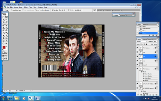
We decided to stick with the original layout that we previously made because it conformed to the typical conventions of the back of an album. We made sure to include everything need for the back of the album; song titles, spine, bar code, institutional information and the logo of the record company. We choose to have a simple font for the typography so that it could easily be read.

The main thing we changed was the main image of the album. We decided to choose this image because the medium close up frame clearly shows the artists for the audience to recongnise. We also thought the pose was effective because the lead singer is the only one looking directly at the camera which catches audiences attention as it seem like he is watching them. We directed them to pose in this way in order to catch the audiences attention, we choose Jordan to look directly at the camera because he's the lead singer and would therefore be the most well know member in the band as a result fans will be more familiar with him. This pose was inspired by images that the Arctic Monkeys used in their albums. 


One of the problems that we faced was the image being too small, we could not stretch out the photo to fit the whole background because the song titles would overlapped the two of the band members, making the album look unprofessional. In order to avoid this we cropped a section of the background from another photo and added it to the image we had chosen.


We decided to blur the background so that it would look as one, rather then two separate images. The brightness and contrast of the image was also lowered so that the bright colours would be more outstanding. Having the background blurry also makes the setting more mysterious, as the location we choose did not connote anything interesting that went with the theme of the album or name.

We then made the spines of the CD more clear by making them black. We also changed the colour scheme from white, yellow, blue and orange to yellow, blue and red because they are primary colours and therefore most commonly used. They are also bright and eye-catching colours making the ablum appeal more to the audience. We also chose these colours because we wanted the album to look colourful as the name of the band is 'The Colours'. We also changed the coulours so that they would stand out against the background because the previous white colour used for the song titles did not stand out. We made a conscious choice to have the track numbers and song titles different colours so that it would be easier for the audience to read and trace whatever song they wanted to listen to.

Because the album is called Canvas we wanted to give the image an effect so that it would look like it had been painted onto a canvas. I firstly thought of having an image of a canvas at the back of the image of the band. I then slightly faded the image of the band so that the texture of the canvas would show through the band photo. However we decided that this was not effective because the image did not stand out as much after it was faded out. We showed the image to a group of people and asked if the image looked like it had been painted onto a canvas. The general response was that the texture did look like a painted canvas but the image should be brighter therefore we changed it again.

Another idea we had was to have the background of the image cut out so that the canvas can clearly be seen. Although this made the typography stand out, the final product did not look finished. It was also very difficult to get the edges of the image to bled in with the image of the canvas. The rough edges made the album look unprofessional.

We finally thought to change the texture of the image. We added a craquelure texture and played around with he spacing, depth and brightness of the cracks until we were sure that the image had a painted effect.

We changed the logo of the record company so that i would look more unique compared to the rest of the typography. We choose to merge the first letters of our group members names and came up with the name RSN Records for the record label name. We choose the Rosewood Std font because its bold and different from the rest of the typography. We added a black stroke to the font to make it stand out even more.
Thursday, 1 March 2012
Rejeced images

This image was rejected because Ankit was placed in the middle suggesting he's the lead singer, this was not the case as Jordan is the lead singer, therefore the main focus should be on him rather then on Ankit


we changed the angle of the camera so that we would get a different background, however re still decided to reject this image because we didn't like the angry facial expression on Jordan

production log
After working on the ancelary task we have decided that the photo's which were take are not good enough for the final product.

For the previous photo shoot we got the band members to wear all plain white t-shirts because we wanted to change the colour of then in photoshop. Although the bright colours when well with the pop genre and were very eye catching it proved difficult to get the same colour tone for all the photos.
We had to change the bad again because some members were not reliable and could not make the photo shoot. We decided to welcome back the previous member, Jordan, and replace Mathew With a new member name Klevis. We believe that Klevis is very enthusiastic about the project and is very reliable. Klevis's appearance is also not much different to Mathews therefore he is also a believable pop band member.
This time round we made made sure that we shoot on different locations as we did not get the opportunity to do so in the other photo shoot. We also made sure we got different angles which we could work with

Wednesday, 29 February 2012
Creating inlays


In order to make the red stand out more we had to keep the hue levels the same however, increase the number of saturation levels and decrease the number of lighting levels. We then did the same with the other members clothing.

To furthermore make the band stand out we decided to slightly blur the background and make it black and white. The selective colouring made tied in well the the name of the band 'The Colours'. We noticed that one of the band members wore a t-shirt with Guns and Roses logo, we had no time to re-shoot the photos therefore we decided to make the logo black and white then we used the smugging tool to blur it out.


Another idea we had was to make the band appear cartoonish, we did this by going into filter then selecting artistic and then choose poster edges. We also thought that it would be a good idea to have the bands name with the letters in different colours. However we realised that the photo looked too childish so we discarded this idea.

This is the picture of the one of the final inlay covers:

For the second inlay image we wanted to use a photo where the band is looking down at the camera, we choose this as we believed that they appeared friendly.We cut around the photo them placed the image on a sky background however it was difficult to get the background to look realistic as the edges appeared to be cut. We also had the problem with getting rid of Ankits Guns and Roses logo. We tried to add an image in front of it however it was difficult to blend in the image with the shirt. In the end we discarded this image.


In the end we decided to choose a photo where the band appear to be working in the studio, we applied the same effect as the previous inlay to create brand identity.

Wednesday, 15 February 2012
production log
Today we finally finished shooting the footage for the narrative part of the music video, we have seen all the footage and we think we are ready start editing the storyline together. We only have to shoot the band performing and add it in between the narrative when appropriate.
Tuesday, 10 January 2012


Subscribe to:
Comments (Atom)